


Wednesday, February 13, 2008

Tuesday, January 1, 2008

Saturday, December 8, 2007
Package Design for ThinkEco Specialty Paints and Inks


 Ink Colored Set Package Design.
 This is the ink bottle box design.


 This is the design for the poster color paint set.
 3D renderings of each bottle use for the brand.
Wednesday, December 5, 2007
Updated: Package Design for ThinkEco Pencils


 For these set of package design I use an embossed method instead of ink printing. The design for the packaging follows well with the brand identity being that art materials should use lesser resources and chemicals that would do more harm to the environment.
Monday, December 3, 2007
3D Package Design for ThinkEco Specialty Paints

 This is my package design for the paint set using the same box for the colored and graphite pencils, but using a different color scheme that follows the variant or product line logo.
3D Package Desgin for ThinkEco Art Supplies - Colored & Graphite Pencils


 This is the package design I did for the ThinkEco Art Supplies project, for the pencil product line. Here I also did a 3D version of the package design.
Sunday, December 2, 2007
ThinkEco Product Line Divisions
 These are the different product line divisions ranging from paints, brushes to sketchpads. Each division represents a certain tree for example like the pink tree for drawing pens represents the Japanese Cherry Blossom Tree. So each product line has its own personality and different theme.
Friday, November 30, 2007
Logo Design for ThinkEco

The first set of logo design is done with a black outline around the logo.

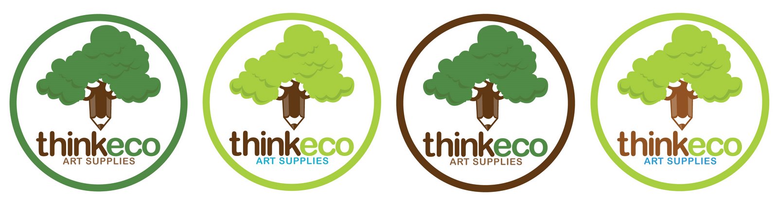

The second set of designs is done without the use of any outlines
Tuesday, November 20, 2007
ThinkTree Foundation Logo
 I know it's been a while since I last posted any of my design works but just recently I was able to finish a logo design for a fictional organization that is all about preserving the environment and tree planting. In coming up with the design for this logo, there were 2 things I wanted to portray; (1) thinking and (2) the environment. I did numerous rough sketches and after a couple of hours just fiddling with one doodle after another I came up with a way to merge both ideas together into one design. In my first rough sketches I did many variations of thought bubbles, since they were perfect symbols that would identity its meaning of generating ideas or either thinking. So I try placing a thought bubble with a drawing of a tree inside of it but in the end I decided to design the trees as the hidden thought bubbles inside the illustration of the logo. With the curve hill would give balance to the overall look of the logo. Then by arranging the trees in sequence and balancing the smaller trees together and away from the bigger tree would then form a symbol of a thought bubble.
In terms of art direction I wanted the colors to be cool and relaxing, which I use a pastel shade of green to set the mood to the entire design. Then for the word mark I added dark brown to create direct contrast from the main color.
Wednesday, November 14, 2007
Good concept for fighting game...

I was browsing the other day on deviantart and I came across this illustration done by Lysol Jones, one of the popular artists on the site and he had this cool concept for a fighting game. He uses the mascots of popular fast food resto's which is kinda neat coz I was exposed with these brands growing up.
Tuesday, November 13, 2007
Myx Music Channel - 3D
Here's my recent work I did for 3D graphics. We were ask to do a 3D rendition for a music channel.
Myx Music Channel
Tuesday, November 6, 2007
Character Animation
Here's my motion piece for character animation, I completed this project during my second term. Enjoy!
3D Graphic: News Channel Assignment
This was an assignment I did for my 3D graphics class where our class was ask to make our own news channel 3D motion piece for a minimum of 5 seconds. So this is what I did for this particular assignment.
Channel News 3D
Channel News 3D
Saturday, October 27, 2007
The New Conquer Logo


Here is the new Conquer logo use for our branding class. We did more research asking people around the first thing that pops in their head when they first viewed the logo and most responses are: strong, organic, powerful, healthy and active. Then we showed them our first design, then we ended up getting responses such as: corporate, modern looking, active and sleek. So from gathering enough data and feedback from our interviews we decided to stick with the new design.
In choosing the logo name we wanted to have something closely related to our USP which is "don't crash. conquer". We chose the name conquer as our identity, reminding our target audience (female college students, ages:19-23) that no matter what happens in school whether your working hard on your projects or just stress out from everything, you have the power to overcome obstacles. To give them self-confidence in making right decisions for their health and to boost up their own self-esteem. So in designing the logo I was thinking of something that would symbolize victory over obstacles that students face like stress, insomnia and etc. For the 3 small leaves sticking out at the end of the logo would illustrate a sword raised up as an symbol of victory over these obstacles and being that its a tea product, would fit perfectly in place.
The package design was prepared by SuHyang, while I took charge of the application process for the brand. Knowing that our target is female college students, we did more studies and research about them and came up with ideas on how promote the brand. (1) students spend long hours studying or finishing projects in schools, time is very essential to them especially in completing certain deadlines in school; (2) knowing the long hours of work most students commute late at night, which proves to be big issue especially for female college students. By studying these facts I came up with this idea for a "survival kit" that we could give to students.
The items include a flashlight, alarm clock, cap, umbrella and a tea tumbler. The flashlight would be ideal for those students who would be commuting home late at night, so by having a flashlight around would help them pass through dark area safely. The alarm clock would be ideal to keep track of time and time management in completing the large amount of work. The umbrella and cap would be for those rainy days especially in Vancouver, BC. The tumbler would be ideal for students to bring with them to school and even to class to enjoy their favorite blend of Conquer Tea. This project has been a fun project not only for me but for our entire group as well.
Tuesday, October 16, 2007
Update: Bubble Tea New Color Schemes


Finally we got our infographic done for our term 3 project for motion design. We did many variations to the color schemes of the Bubble Tea brand and we did a few samples of the brand application.
Subscribe to:
Posts (Atom)